There is nothing like taking your boat out to explore new lakes! But you must know how to read a nautical chart in order to operate safely.
Nautical charts are maps used in navigating bodies of water. They provide information on depths, dangers, harbors, bridges, and aids to navigation but nautical charts look a little different from land maps. Charts have a lot of detail and they vary somewhat around the world. They take time and instruction to master but you can get the gist with a few basics. Let’s look at the features of typical US charts…
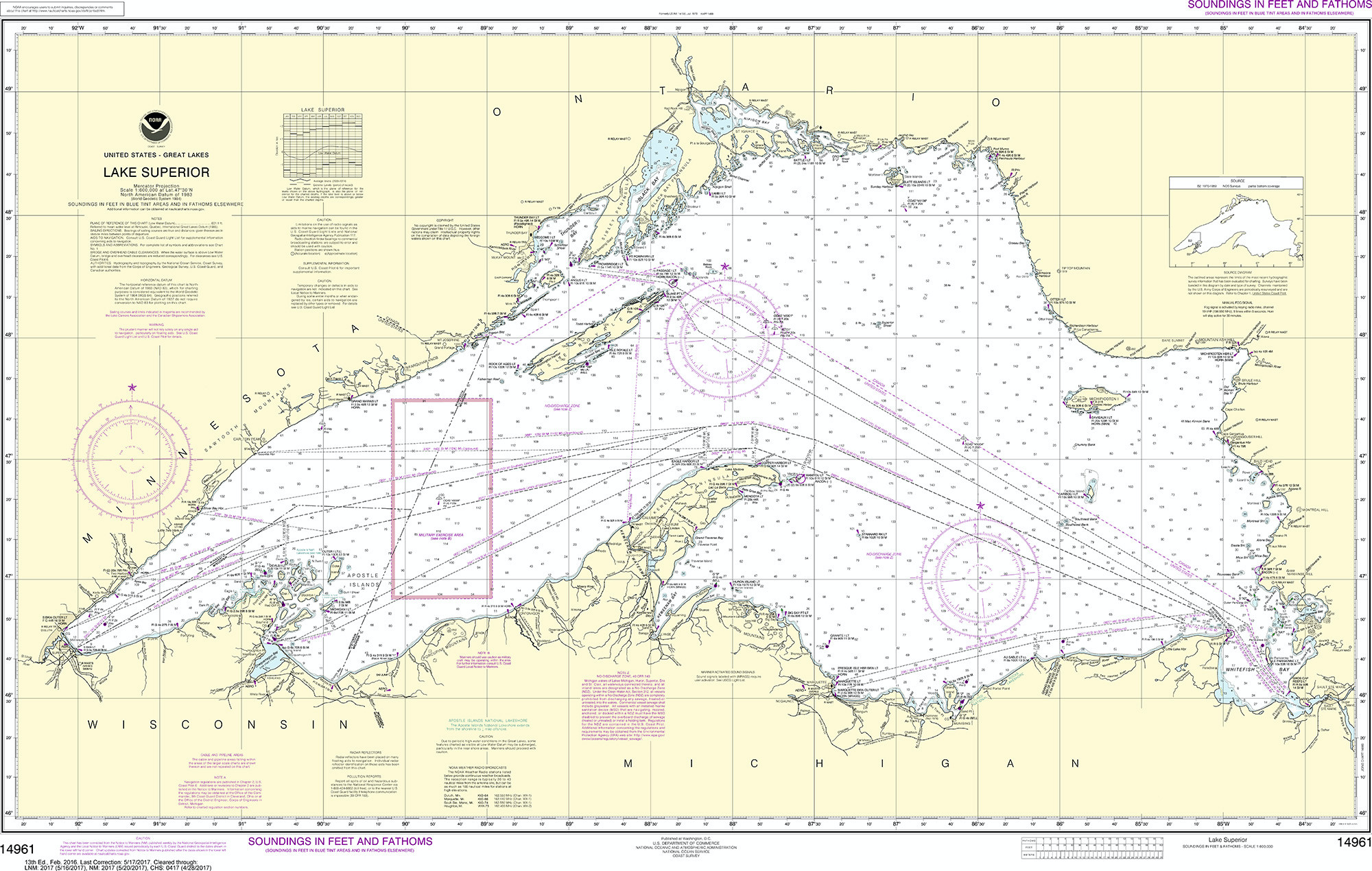
Scale-
Small scale charts are appropriate for boating on open waters and will show less detail. When navigating near shore, use large scale charts that cover a smaller overall area in greater detail that you’ll need to transit safely.
Depths-
Numbers printed on the water areas of the chart indicate the depth of the water at that spot. However, a 2 on the chart might mean two feet, two fathoms, or two meters. It is essential to know which unit of measurement is used. This is always shown on the face of the chart in large print — SOUNDINGS IN FATHOMS AND FEET, for example. A fathom, by the way, is six feet, so on a chart with soundings in fathoms, a number such as 03 means zero fathoms and three feet. The water at this spot is three feet deep at MLLW. A sounding of 55 would be 35 feet (five fathoms and five feet). In 1992 U.S. charts began switching from feet and fathoms to soundings in meters. If your brain hasn’t made that switch, you can divide soundings in meters by 0.3 to get the approximate depth in feet.
The soundings printed on the chart normally represent the depth at mean lower low water (MLLW), so the actual depth is usually more than the charted depth. However, when the tide table shows a negative low-tide entry, actual depths will be less than the chart indicates. When the depth of the water is a concern, you will need to know the height of the tide.
Charts show aids to safe navigation like buoys, beacons, lights, channels, etc–
Diamonds are buoys, squares and triangles are fixed markers, and teardrops represent lights with accompanying notes on their flashing pattern printed alongside. You’ll need to learn what these and other symbols look like and what their colors mean. Key landmarks used to assist with visual navigation, like large tanks or towers ashore, are generally depicted with a circle and a dot next to them. They’re great to get visual bearings and a way to double check against the chart where you are.
Most charts will show dry land in a tan color and water in shades of blue or white–
White will be very deep, light blue very shallow, and a standard blue shows a depth somewhere in between.

Chart Notes-
To avoid cluttering the parts of the chart showing navigable water, cartographers show details about certain features, dangers, restrictions, and warnings in “chart notes” elsewhere on the chart. Some notes are about the entire chart; others relate to a specific feature or portion of the chart that uses a nearby label, such as “(see Note B).” Around the outside of the chart, in the lower left corner, is the chart’s edition number and publication date. In the lower right corner is the title and scale of the chart. The full chart title, chart notes and other information are stacked underneath the NOAA logo.
Distances are shown in either statute miles (inland waterways, lakes, Intercoastal Waterway) or nautical miles (1.15 statue miles) for offshore waters–
A knot is a unit of measurement that depicts distance over time – as in traveling at 10 knots means you’ll make 10 nautical miles per hour.
Now that you know the basics of a nautical chart its time to study up! Get a copy of the nautical map for your desired lake and take some time to learn the route you will take. This is an important part of boating safety but remember that the nautical chart is a snapshot of the lake at the time, meaning buoys can drift off station and sandbars shift with weather. Always keep your eyes “out of the boat” to verify visual information and compare it with what you’re seeing on a chart.
This will help you live life to the fullest at your new lakefront property!
Posted by Scott Freerksen “The Lake Guy”